반응형
titanic 데이터 전처리

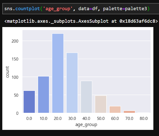
나이대 컬럼 (age_group)을 만들었다.
이를 countplot으로 시각화해보자
https://steadiness-193.tistory.com/192
Seaborn - 빈도 그래프 : countplot
이산값을 나타내는 그래프 각 범주에 속하는 데이터의 개수를 막대 그래프로 나타냄 데이터 불러오기 https://steadiness-193.tistory.com/180 Seaborn - 산점도 : regplot [산점도] 서로 다른 2개의 연속 변수 이
steadiness-193.tistory.com
countplot은 위 포스팅 참조
기본

기본 색상은 bar마다 다른 위 결과다.
color 옵션 설정

color에 넣은 #FC7F77은 Kuler에서 찾아낼 수 있다.
color.adobe.com/ko/create/color-wheel
https://color.adobe.com/ko/create/color-wheel
color.adobe.com

위에서 찾은 #FC7F77을 넣어준 것이다.
palette 옵션
전체를 하나의 색깔로 하는 것이 아니라 각기 다른 색으로 설정해주려면
palette 옵션을 이용한다.


이제 color 옵션 대신 palette 옵션에 넣어주면 된다.
반응형
'시각화 > Seaborn' 카테고리의 다른 글
| Seaborn - 패싯 그리드 : FacetGrid (0) | 2020.08.01 |
|---|---|
| Seaborn - 스타일 변경 : set_style (0) | 2020.07.31 |
| Seaborn - 산점도 그래프 : lmplot (0) | 2020.07.31 |
| Seaborn - 관계 그래프 : pairplot (1) | 2020.07.31 |
| Seaborn - 조인트 그래프 : jointplot (0) | 2020.07.31 |


